July 13, 2026
How to Get AI to Keep Brand Consistency
The secret is human.

AI can make a thousand images in an afternoon and every one of them will look like a different company, unless you give it a rulebook and a human to steer. Here’s exactly how we do it at GrantOrb. I’d say we’ve cracked the code on brand consistency with AI. Every one of our websites — the homepage, the FIFA café guide, the funding page, and the consultants page — has the same theme running through it, and so do the hero images across our product blog.
AI can make a thousand images in an afternoon. That’s the miracle. It’s also the problem. It’s very, very hard to stay consistent with generative AI — unless you build a deterministic AI system like GrantOrb. So how did we pull off brand consistency using a chatbot?
We run every visual surface at GrantOrb — the marketing site, the app, the blog, a whole FIFA café guide — on AI. And it holds together. Same cream paper, same deep-green ink, same sunset pops, everywhere. People assume that takes a big design team. It doesn’t. It takes two things: a brand written down as a file the AI can read, and a human who stays the creative director.
Here’s exactly how we do it.
Consistency is the hard part, not creativity
Getting AI to make one beautiful thing is easy. Getting it to make the hundredth beautiful thing that looks like it came from the same studio as the first — that’s the whole game.
The reason it’s hard is that a chat prompt has no memory of your brand. Every session starts from zero. You say “make a blog hero, warm and optimistic,” and the model reaches for its own idea of warm and optimistic, which drifts a little every time. Multiply that drift across every image, every page, every founder who’s in a hurry, and the brand smears.
So the fix isn’t a better prompt. It’s giving the AI something it can read before it makes anything — a single source of truth.
Write the brand down as a file
Ours lives at site/BRAND.md. It sits right in the codebase next to the code, and the rule is simple: read it before you generate any art or choose any color. It’s the first thing I point every AI collaborator at, human or model.
It’s not a mood board. It’s a spec. A few things it pins down:
- The exact palette, as tokens with hex codes and roles.
- Hard rules, stated as laws. “Ink on cream is the only body-text pairing.” “Cream grounds, always — no white, no black.” “Grain and texture are always present; flat untextured fills read off-brand.” These aren’t suggestions. They’re the difference between on-brand and almost.
- A locked base prompt for our image tool, word for word, so nobody improvises the color words. Plus one motif line per piece.
The instant the brand is a file instead of a feeling, AI stops guessing. It’s not being creative about your identity anymore — it’s applying a rule you already decided. That is the whole trick to consistency at scale: decide once, in writing, then let the machine repeat it faithfully.
Where the look actually came from
Here’s the part people find surprising: we didn’t design the brand in a brand exercise. We found it in things in the real world, from the historical record of our own ideas and knowledge. And then wrote down what worked.
But before any file existed, there was a conversation — me describing a feeling. I didn’t hand the machine a spec; I handed it a story from my own world. I told it what I was drawn to: warmth over sterile tech, a risograph zine you’d actually want to pin to a wall, the optimism of a solarpunk future instead of another cold, blue SaaS. I brought the images I already loved — the sunset prints I’d been making myself, deep greens against burning orange — and pointed: that warmth, that’s us.
A machine can render a look flawlessly, but it can’t want one. The wanting — the taste, the reference, the story of why this feeling and not another — has to come from a person. That’s what started everything.
The FIFA guide was the base inspiration. Before any of this, we built a little café guide for Vancouver for the World Cup — “Good Spots, Vancouver,” in a risograph gig-poster style: full-bleed, textured, bold, warm, human. It was a side project. But when we looked at it, we realized that was the feeling we wanted everywhere — a “risograph print of a solarpunk future,” optimistic and printed, the opposite of cold SaaS. The FIFA page gave us the DNA.
The /funding page gave us the font and the palette. When we redesigned our funding page, we settled on Fraunces for display type and locked in the exact colors. It came out right. So instead of admiring it and moving on, we lifted the font and the palette straight out of that page and made them the standard.
Then we distilled both — the FIFA feeling and the funding-page specifics — into BRAND.md. The brand guide is a description of what already worked, not a theory of what might. That gave us a much stronger foundation for AI to build on — because every rule traces back to a real thing we already loved, we redesigned the GrantOrb.com homepage in half a day.
The human is the creative director — and stays there
This is the part I want to be loud about, because it’s the part the “AI does everything now” crowd gets wrong.
The AI is an extraordinary executor. It is not the art director. I am. Its job is to render the brand faithfully and fast; my job is taste, direction, and the veto. Consistency comes from the rulebook; soul comes from a human interjecting at the right moments.
A few real ones:
- “Forget the Japanese bike.” Early on, the FIFA guide drifted into a dreamy Japanese-forest aesthetic. It was pretty. It was also wrong for us. I killed it in four words. AI will happily follow a lovely tangent forever — someone has to say no.
- The name, narrowed by hand. The guide went “Good Coffee” → “Good Places” → “Good Spots.” Each step was me pushing for something tighter and more human. The model can generate a hundred names; choosing the one is direction.
- Picking the “joy note.” Our pink — rose — isn’t a random swatch. I pulled it out of a sunset print I loved and named it the joy note in the spec.
- Every blog hero wanted to be a sun. When we started making hero images for these posts, the AI turned everything into a sun over a horizon — gorgeous, and completely identical. A grid of suns isn’t a brand; it’s a screensaver. So we evolved. I pushed for a distinct motif per post — radar rings for the grant search, two diverging paths for “a safe bet and a bold bet,” a constellation for the chatbot connector — each still cream, ink and sunset, but its own idea. The trick that finally broke the habit was telling the tool “no sun, no horizon” and naming a concrete subject instead — a fix I wrote straight into the brand file so nobody re-learns it. Creative direction includes teaching the machine its own bad habits.
- Blessing the canon. When a few hand-made prints came out perfect, I marked them in the spec as canonical and told the generator never to overwrite them. The human decides what’s finished.
None of that is prompt engineering. It’s editing. It’s taste applied at the exact moments the machine can’t supply it. The model gives you speed and range; you give it judgment and a spine.
The payoff: every surface, one brand — even the fallbacks
Once the brand is a file and a director, the consistency comes almost for free.
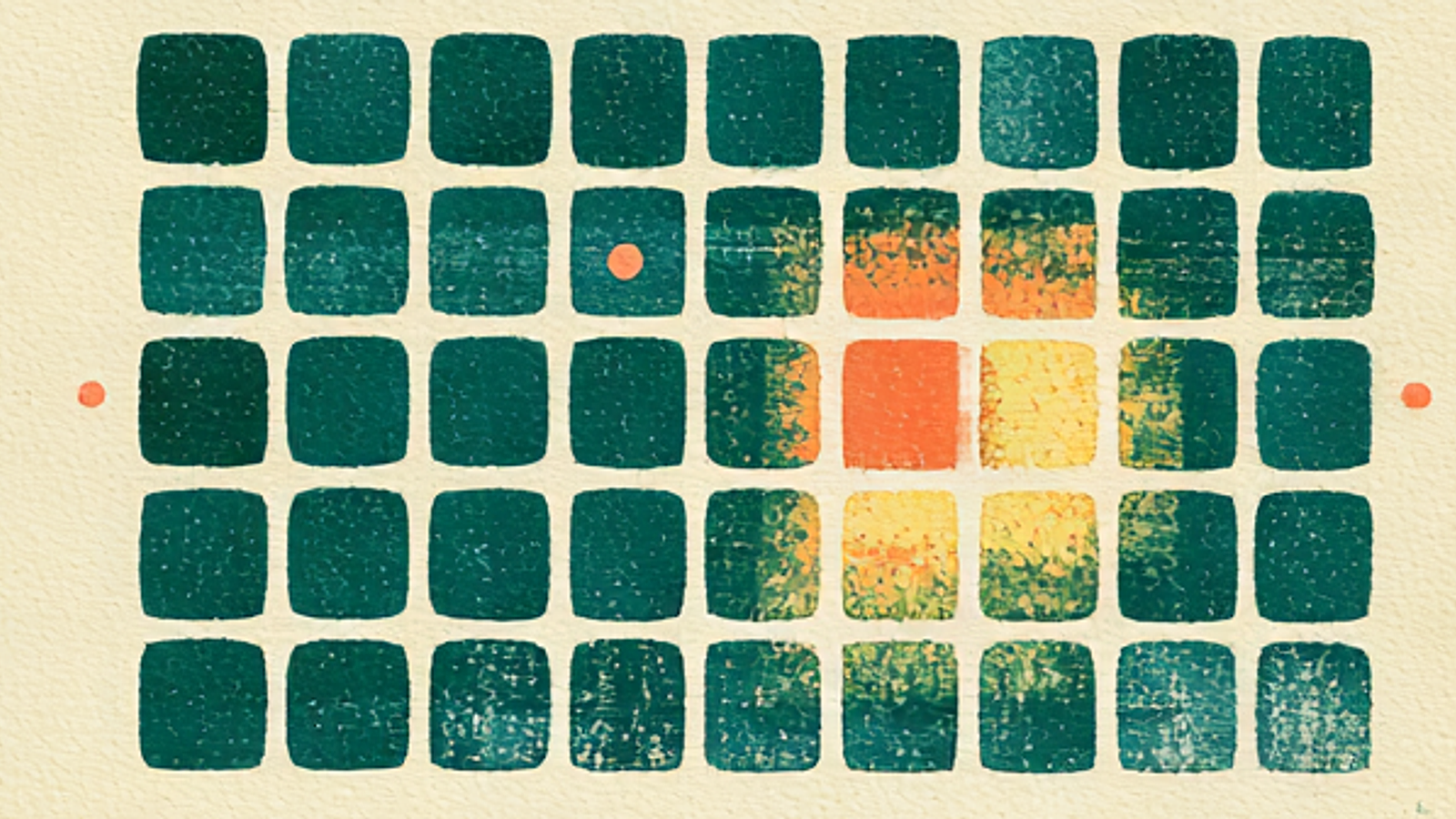
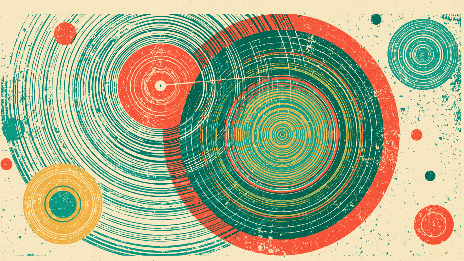
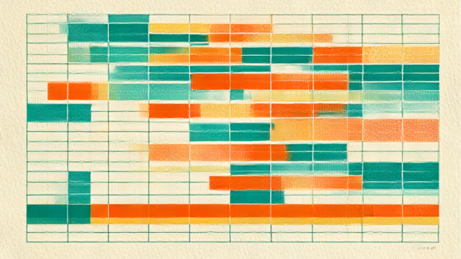
New blog post needs a hero? There’s a deterministic generator that renders an on-brand image from the same palette tokens — same seeds, same pixels, every run — so even the automated fallback can’t go off-brand. (The hero at the top of this post came out of exactly that system.) New landing page? It reaches for Fraunces, cream, ink-teal, gold, because those are the tokens, not a choice. A teammate opens a fresh chat and asks for art? The first instruction is “read BRAND.md,” and the drift never starts.
That’s the whole architecture: the file removes the guessing, the human removes the drift the file can’t foresee.
How to steal this workflow
You don’t need our palette. You need our shape. If you’re using AI across your brand:
- Find your look in something you already made that felt right — don’t design it in the abstract. Ours was a FIFA café guide.
- Write it down as a spec, not a vibe — exact colors with hex codes and roles, fonts, and hard rules stated as laws (“only this text pairing,” “always this texture”).
- Lock your prompts so nobody improvises the words that matter, and record the fixes you discover so they’re never re-learned.
- Point every tool and teammate at the file first. Read the brand before you make anything.
- Stay the creative director. Say no to the pretty tangent. Name the joy note. Bless what’s finished. The machine executes; you direct.
AI didn’t replace our design taste. It gave it reach. One person’s judgment, written down once, now shows up faithfully on every surface we ship. That’s not less human — it’s a human, amplified.
I’m the founder of GrantOrb, an AI-first startup, and I build with these tools every single day. If you want to talk brand, AI workflows, or how we run all of this with a tiny team, find me on LinkedIn or X.
Originally published on Substack — read the original →.